I’ve been deliberately-quiet about what I do day-to-day professionally so far. I’m not sure why; I think most of it is a desire to maintain humility and to head off dismissal of the effort that I like putting into this project (“Oh, well, you’re a visual effects artist, so you probably just put these photos in the computer and computer them up, and how hard can that be?”). When I started this project, I was working as a computer graphics artist at Weta Digital in New Zealand. Prior to that, I worked for a while at the now-defunct ESC Entertainment on two of the Matrix films (as well as the ever-popular Catwoman), the now-defunct Big Idea Productions (makers of the “Veggie Tales” children’s animated series…I sang in one of the Silly Songs), and taught for a while at Notre Dame. Currently I’m at Pixar.
“What I do” tends to vary per-project, but my interests are spread amongst shading, lighting, rendering, and “effects” work. Effects (or FX, as it’s oft-abbreviated) usually entails things that are difficult to hand-animate or model: natural phenomena like explosions, rain, dust, or funky things like ‘rips in the fabric of space-time’ (as I got to work on for Jumper, an otherwise pretty-terrible movie). One of the most captivating FX tasks for me to play with, however, is water.
Water is an interesting phenomenon to try to represent mathematically on a computer; ‘what water looks like’ is a product of many variables. Water reflects and refracts its environment, and can carry participating media that scatters light as it bounces around inside a water volume. Water can churn and froth, can split apart and rejoin itself, and interacts with other objects in interesting ways. There’s no ‘correct’ way to make water in computer graphics, which is why it’s so interesting to me; every time I sit down to work on a shot that involves water, I try it a different way, seeking to get the best result with the tools I have at my disposal (which, in a software-driven industry, are constantly changing).
One of the ‘easiest’ representations of water is an open ocean. I say “easy” because an open ocean with no objects interacting with the water surface allows us to shortcut or sidestep many problems that are otherwise difficult to deal with. Back in the late 90’s, a guy named Jerry Tessendorf theorized that we could take a set number of wavelengths and use them to represent an open ocean.
To get all supernerd about it: there exist in the world several data-gathering “sea state” mechanisms — ways of mathematically-describing “this is how the ocean looks right now”. These are real-world mechanisms…sometimes an array of sea buoys are used, other cases use satellite data, etc. The data captured by these methods is then collected into a “wave spectrum”, which is basically a collection of wavelengths that describe what the ocean surface is doing at a given moment. We can take these spectra and perform an inverse Fourier transform on them to yield a pattern that, when applied to a patch of mesh in a 3d package, can yield something that resembles an ocean.
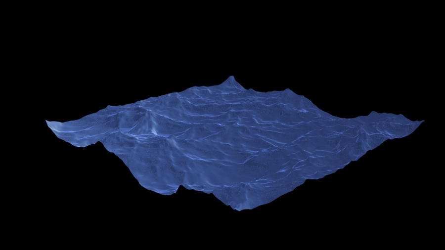
While this approach to representing an ocean has been refined and improved over the last decade, the general idea remains the same. “Tessendorf waves” are almost invariably what you’re seeing when you watch any film that leverages computer graphics to represent an ocean. King Kong, Avatar, Tintin, Brave, Cars 2…these are films I’ve been fortunate enough to work on that all feature this approach to representing oceans.
I’ve never lost my interest in trying to make my own servicepieces for this project, but the road for doing so is notably slower than for cooking. I’ve been taking lots of classes as I can afford to, to learn things like machining, welding, woodworking, etc. in an effort to piece techniques together to understand how I might craft a servicepiece myself. I recently read about services such as Shapeways and Ponoko that offer users the ability to 3d print an idea in ceramic. This idea is particularly interesting to me, as you have to use a computer as the input to a 3d printed piece. Because I spend so much time representing reality on computers, I wanted to see how I could explore this approach as a way of making a servicepiece. And because I have a long and intimate interest in working with water, using Tessendorf waves as a source of inspiration seemed like a unique way to make it my own.
I started roughing out my idea with zero regard for the design constraints inherent to 3d printed ceramic. The FX department at Pixar makes heavy use of Houdini as a tool for generating various effects, but I didn’t know it before coming here 3 years ago. I still have a lot to learn, so I decided to use it as my prototyping suite, forcing myself to get to know it better. I really love Montgatina’s Tabula plate series, so I started with it as a reference. My first question for myself had to do with the scale of waves I wanted to involve.
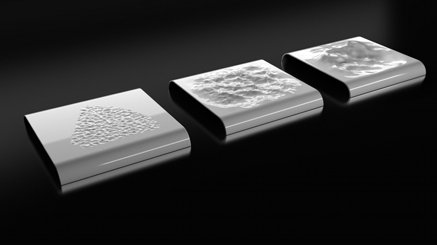
On the left, I’m representing an “annulus“; when making an ocean for a given shot in a film, I only care about water that the camera sees, so I often leverage a shape that makes sense when viewed from the camera, but viewed from other angles looks a bit funky. In the center, I’m playing with more of a ‘mid-scale’ ocean, like what you might see standing at the bow of a giant cruiseliner. On the right, I’m getting extremely close to the water, as if I’m bending over the edge of a rowboat and nearly touching it.
Of the three variations, I liked the aesthetics of the rightmost one. It felt fundamentally more beautiful to me — elegant, cleaner and (as Sarah pointed out) way nicer to scrape a fork across. The other ones I imagined to be annoying to actually eat off of.
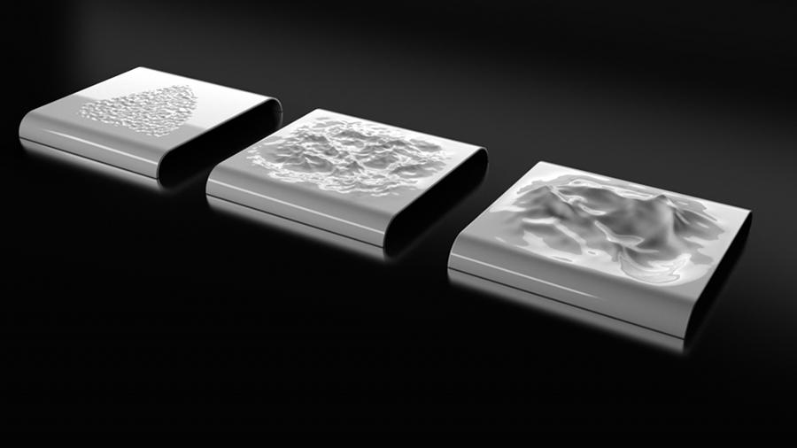
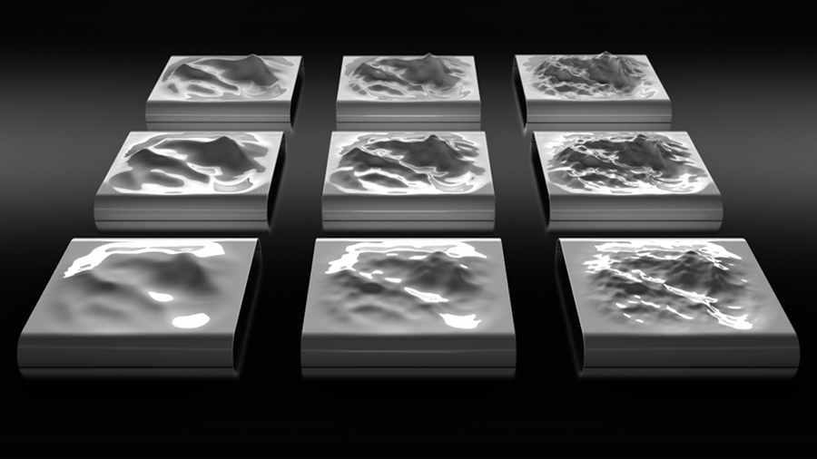
I had some questions about the amount of detail I want to see at that scale, so I cloned off several versions of the rightmost one, adjusting things like wave height and the overall ‘resolution’ of the wave (i.e. how much fine detail we see). At lower resolutions (seen on the left) the plate started to look less ‘watery’ to me, and at higher resolutions (on the right), the whole pattern looked more like a mountain range that I was viewing from afar rather than water. The centermost one felt the best to me, so I forged on with that one.
I imagined this design being nice and big…15-17″ or so, and maybe 3″ high. I tweeted these renders to Shapeways and Ponoko, asking them their thoughts on how reasonable this design was. Ponoko responded soon to tell me that it was basically awful. It’s way too big than what can be 3d printed, and structurally was unlikely to survive the process. Shapeways pointed me to this outline of the design guidelines for printing in 3d, which I realized I probably should have consulted first. I read it roughly, paying closest attention to the bounding box specifications: these made me realize I was going to be creating a much smaller plate than I’d originally imagined.
I spent a few days vacillating about this; on the one hand, I really, really love the above design. But I worried the only way to make it was to hand-sculpt it, which took away some of the poetry I find in literally printing the work I do every day. A friend suggested I could CNC mill this shape from something like wood, make a mold from it, then slipcast porcelain from this mold. This sounded like a possibility, but also meant quite a bit more expense (having a mold made from a shape can cost over $500, and that didn’t account for the time and money I needed to spend to teach myself how to do all these steps). I’m not ruling out this approach (I’d love to learn how to do this, in fact), but I thought it might also be worthwhile designing within the constraints of the 3d printing process, both to learn and to appreciate what it has to offer.
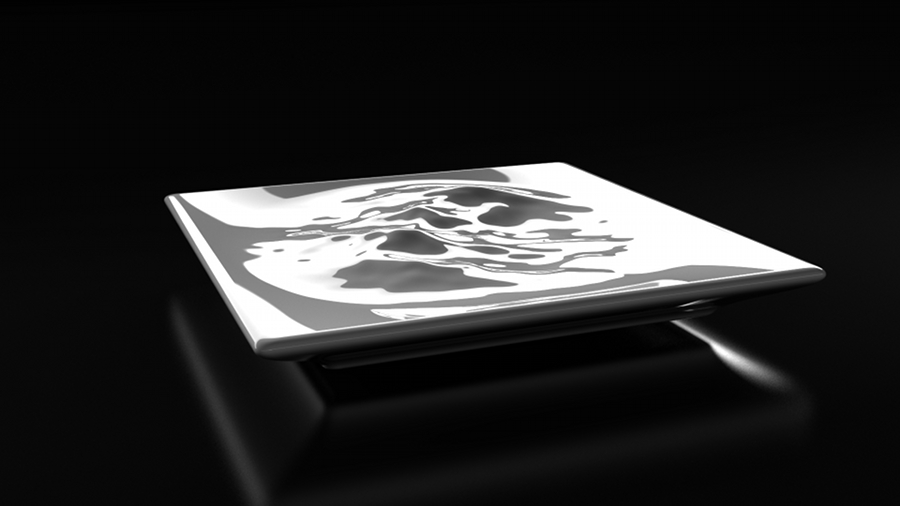
So, I redesigned my plate. I did so from an informed position, knowing at least how I wanted the wave pattern to look. After a couple tries, I landed on an idea like this, measuring about 7″ square.
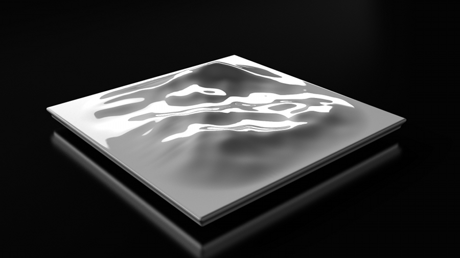
I tried a few variations; I compared what the straight edges felt like in contrast to allowing the natural contours of the Tessendorf pattern to come through.
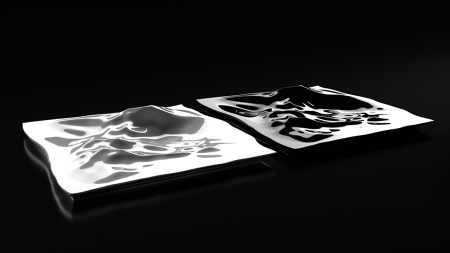
Shapeways/Ponoko also offer glazes in black as well as white. I think a black plate would be pretty badass, but decided to opt for white for the first attempt.
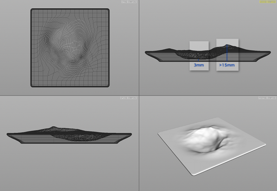
A Tessendorf pattern displaces a surface both positively and negatively; a flat plate gains both mounds (at the wave crests) and ‘bowls’ (at the wave troughs). I felt strongly that I wanted my plate to have both; I really love the idea of being able to plate sauces or liquids in the troughs of the wave patterns, rather than only have mounds to work on. This meant the plate had to be fairly elevated, to allow for downward displacement. It’s not obvious from these renders, but this design featured a flat bottom (if you flip the plate over, the surface you see is flat, rather than inversely-contoured to match the top surface), which I would learn later has significant ramifications.
Shapeways charges by surface area for 3d printed ceramic, while Ponoko charges by volume. I uploaded this design to both to compare pricing. For this design, Shapeways yielded a price about $50 cheaper than Ponoko, coming in at around $120 total. I placed my order, then sat back to wait for the robots to do my bidding.
Three days later, I got an email from Shapeways; they had found issue with my design, and had rejected it. Rather than refunding my money, they gave me a ‘store credit’. They said they could give me a refund if I threw a big fit (they worded it more nicely than that, but that’s how I read it), but they wouldn’t move forward with printing this design…I needed to fix it.
The problem was in the ‘bowl’ area of the plate: the negatively-displaced top surface came within 3mm of the flat bottom surface, yielding a wall thickness of 3mm. The minimum wall thickness for a portion of printed ceramic is noted in the design guidelines as 6mm, but Shapeways recommended 8-10mm would be more appropriate for the plate.
Going back and rereading the design guidelines more carefully, I took note of the wall thickness minimum and maximum. Wall size needs to be between 6mm and 15mm, with an avoidance of sharp thickness transitions. I realized that if I lifted the top surface so that my too-thin area was at least 8mm thick, I would end up with areas that were way thicker than 15mm (because, recall, the bottom of the plate was flat).
These design guidelines felt inscrutable to me, and I was feeling frustrated. I had emailed Martin several years ago asking questions about working with porcelain, and he had recommended a book for me to read up about it. I went back through and read it more carefully over several days, and did a lot of reading about how ceramics are fired (something that, until now, I hadn’t bothered to research much).
Ceramics (be they clay or forms of porcelain) have a water content at the time they’re sculpted. 3d printed ceramic is no different; small dots of clay are deposited in a designed shape by the 3d printer’s nozzle, and are held together with a binding agent. While the clay is wet, a piece is said to be in a ‘green’ state. It’s left to dry for a period of time; the faster it dries (e.g. by heated air), the more of a differential forms between the dried clay and the wet clay underneath it. If this differential is too high, the clay can warp or crack. This phenomenon isn’t unique to clay; I’ve experienced it when dehydrating ingredients too fast. The Yuba I cooked recently, in fact, did this; the yuba was a big ball when I put it in the dehydrator, and I tried accelerating the rate of dehydration for one batch by turning up the heat of the dehydrator. The outer surface dried and tried to shrink, but the interior wasn’t dry yet, so the exterior cracked open like a layer of paint. Clay can do the same.
To reduce the potential of this happening, one can seek to reduce the opportunities for large humidity gradients; e.g. by keeping the wall thickness no smaller than 6mm and no larger than 15mm. The idea is that you want to let water evaporate from the clay at a steady, constant rate. When the clay is fired (to permanently harden it), if any water still exists in the clay, it turns to steam, again causing cracking or warping as the steam tries to escape.
Learning about this fascinated me, and I spent several more days closely-inspecting all the plates and bowls we have in the house. Almost all of them exhibited this exact property; I measured points all around Martin’s plates I’ve bought over the years, as well as several Montgatina bowls, plates we own from Crate and Barrel, and even some Hadley crockery from my mom. All of it features very smooth, soft transitions from wide to narrow measurements, with no individual part drifting too far outside the measurements noted. I suspect different materials have different drying rates, and therefore allow for slightly-different design constraints, but for the most part the fundamentals hold true here.
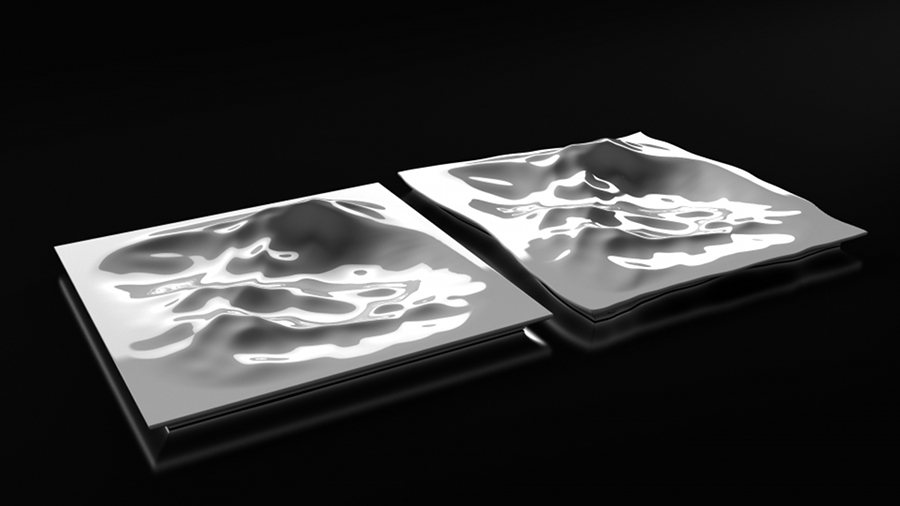
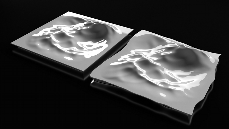
Bearing this in mind, I started reworking my design again, paying much more attention to the contours of the plate and how thickness was distributed throughout it. I realized that solving my thickness problem would mean contouring the bottom of the plate to match the curves of the top, and realized this is exactly why Martin’s plates exhibit this property. I also noticed a few characteristics in Martin’s plates that I felt would be nice to incorporate, namely the raised outer edge to give more a sense of depth to the deeper areas of the plate. There are some visual tricks I feel like he’s playing to solve structural problems without throwing the overall feeling of weight out of balance. I eventually landed on something that looked like this.
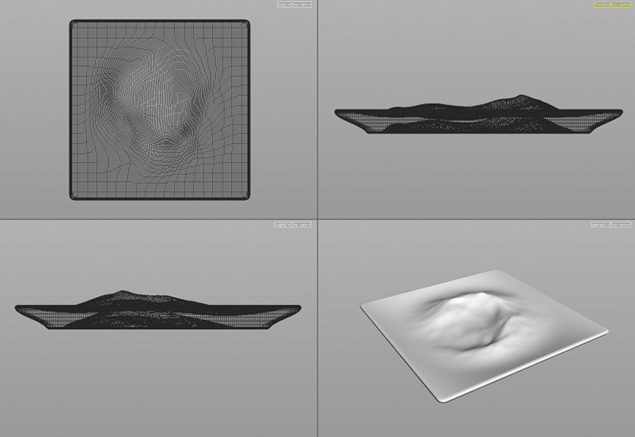
One of houdini’s strengths is that it allows for entirely modular design methods (we call it “proceduralism”). This meant I could adjust some areas of the plate without affecting others. Once I’d established the outer edges, I could shift around the actual wave pattern, ‘scouting’ for an area of the pattern that looked nice. Incidentally, this is exactly how we choreographed waves hitting the Venture as it crashed onto Skull Island for Peter Jackson’s “King Kong”: we generated a large ocean mesh, then ‘slid’ the wave pattern around hunting for a good-looking wave that could smash against the boat and push it in the direction we wanted the action to be.
After a few more finishing touches, I again sent the design off to Shapeways to print. I noticed that by contouring the bottom of the plate, I’d lessened the volume but increased the surface area. I was curious of the price difference between Shapeways and Ponoko at this point, but because I had “store credit” at Shapeways, I pushed forward with them without investigating further. Ponoko had told me earlier that both outfits actually use the same production facility, and I presume the design constraints result in their pricing structures being very similar once all thickness issues have been addressed.
About a week later, I got an email from Shapeways, this time confirming that the plate had been produced and was en route to me. I held my breath for a few days; honestly, I really liked my renders but didn’t expect the final product to look nearly as slick. I braced myself for a funky color difference, a less-shiny finish, or worse: cracks or warps formed during the firing process.
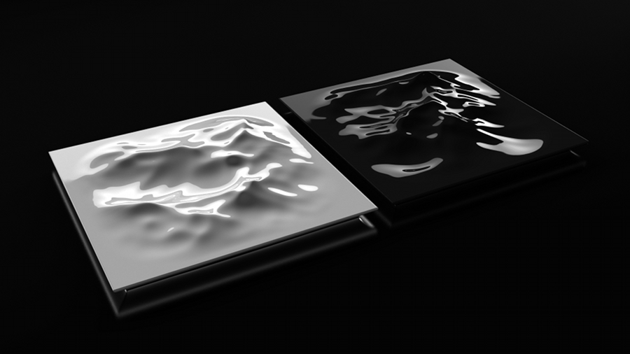
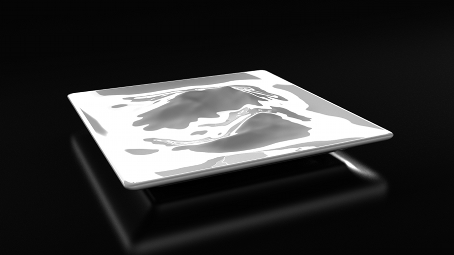
It turned out my fears weren’t unfounded; when the plate arrived it was significantly warped; all of the edges were way lower than in my design, and a few of the corners had sagged significantly. The plate as a whole had sagged so much that the ‘bowl’ area I’d tried so hard to preserve was nonexistent. On top of this, there were several weird anomalies that were introduced during the printing process that weren’t in my original design: an odd ‘stripe’ and an area of ‘lumpiness’. The glaze was notably less glossy than I’d imagined too.
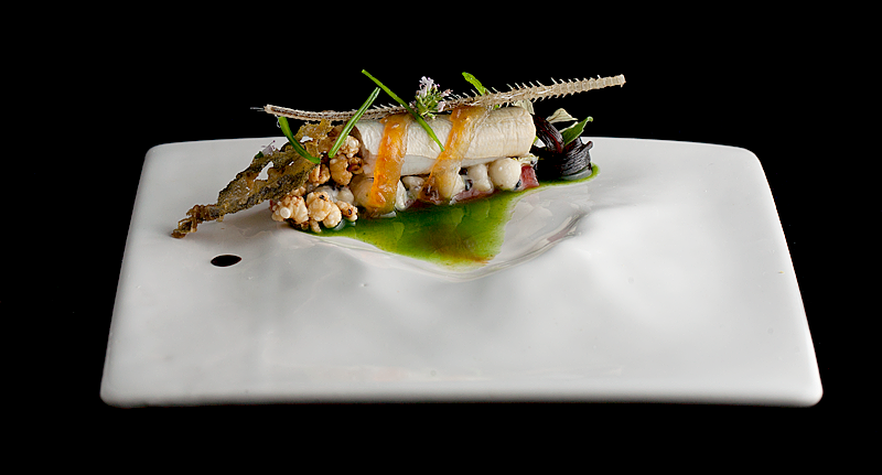
I tried plating the dish I made this weekend on the plate, and photographed it in a way that accentuated its interesting parts while obfuscating its weaknesses. Those photos can be seen in the main post for that dish, but here’s a more unapologetic one that clearly highlights what this thing looks like. I wouldn’t ever actually present a dish to someone on this; the quality’s just not there.
I wrote Shapeways to ask whether my expectations are too far off for this process; I have not yet heard back as of this writing. I still think the design is pretty interesting, but if this represents the limits of this technology, it’s not the right tool for me to use for making my own serviceware. I think I’ll be looking into some ceramics classes, but hey…science.
Allen-
This was a long read but absolutely fascinating. As a fan of movies, movie-making and of course food, this post was like crack! I am very interested in my own service pieces as well, so I would love to find out how your story ends with Shapeways (or any other vendor)
Thanks man! I’m still waiting to hear back from Shapeways, I’m curious if this is expected performance for this way of making things…
Allen, this is a voice from your past. I finally convinced Henry today that your dad didn’t invent colors. I showed him this website because he’s doing a paper on cooking. We both agree that you might be insane. Let me know if you ever need more consultation with 3D printing. It’s my full time occupation, so I’ve learned some tricks too.
P.S. The twins just finished their freshman year at ND.